Colors trends have a significant role to play in how we perceive our everyday lives. We give a lot of importance to ensuring we choose the best colors for anything important to us. This includes our homes and everything inside it. Recently we have gone through a couple of years when deciding what color will best suit our surroundings was the last thing on our mind. And fortunately, we are slowly recovering. And there has been no better time to go for a quick, positive reset. Be it subdued neutrals or dark and bold shades, most of us would be glad to welcome a change to what we have been accustomed to for quite some time. And it is guaranteed that this would ensure you get that much-needed positivity with this fresh revamp.
We would love your 2022 to be a year of rejuvenation. So, we bring you some of the trendiest colors and schemes that you could go for to influence your spaces.
WARM NEUTRAL SHADES
It’s already known that warm colours are an excellent choice for sofas and upholstery, and people are trying to adopt the same shades for their entire rooms nowadays. There is a subtle shift in preference from chaotic colors to neutral tones in the market. Warm neutral colors offer very less distraction inside a particular space. Even from a business point of view, it works with any set of traditional brand shades.
These colors are also becoming popular largely due to the increased anxiety and fatigue today. Working professionals obviously prefer to return home to a less stressful, more peaceful, and stimulating environment. This choice is particularly perfect for areas that have a lot of natural light. These are also characterized by clean lines, and have minimalistic wooden furniture.

Creamy or warm whites, plain cream colors, beige shades, etc. are becoming increasingly popular with homemakers today, owing to the soothing and cozy feel they ooze. For those looking for a combo, white oak, beech, and other light woods provide an excellent alternative. Belgian Cream, Swiss Coffee, Antique White, and Cottage White are some of the more versatile choices in this category. And the best thing about this trend is the versatility it offers when searching for additional accessories. One can use the same schemes that go incredibly well with natural materials like canvas, wool, cork, hemp, etc.
CRISP SHADES OF WHITE
It is almost impossible to go wrong with white, and there is no theme that it can not adapt to. This classic and evergreen set of colors is still a go-to option for designers and consumers alike. It is especially popular as there are many who consider bold shades to be very heavy, and choose to go for a safer and cleaner option. The fact that whites often give that open and breezy atmosphere only accentuates this. White shades also make interior spaces seem larger than they are. As one can see, the advantages are many!

As whites make excellent pairs with almost any color, it is a very versatile addition to your interior themes. Add accessories like landscape art or other wall art, rugs, showpieces, etc, and the whites will ensure that they pop.
MUTED GREENS
Muted green colors are known to have that quality of zen. For those who are looking to bring about a comforting feel into their interiors, these are a perfect choice. These shades will surely help quiet one’s mind and make spaces feel less and less cluttered. It is particularly apt for spring since it goes well with the theme of freshness and optimism.

People who are trying to design areas where they would usually want more creativity and flow of ideas may go for such colors to invoke a feeling of being inside a natural sanctuary. There are colors like Sea Palm, Padded Leaf, Collard Green, and Cypress Garden that help combine modern elements and organic undertones to your interiors. Throw in some wooden articles or accessories, and you have a really fun and aesthetically pleasing space!
TONES OF TERRACOTTA
It does not seem like nature would ever stop influencing us in our pursuit of optimizing our interior designs. Shades of brown and red have been popular when it comes to designing rooms, and it rightfully continues to be so. Especially for spaces that feature intimacy, like bedrooms, it is the safest and best option to go for organic colors. They give a vivid sense of individuality to a space, and would also not appear very overwhelming due to their soft feel.

But it is important to provide the appropriate kind of lighting as without this the rooms will not look great. One advantage of such an arrangement is that you could switch up the mood inside the room by getting to reflect different kinds of light off the walls – bright lights for social events or moodier seasons, etc.
NATURAL GREEN COLORS
Due to an increase in general awareness and consciousness around health and well-being, people today prefer some kind of presence that screams nature in their interior designs. And what better way to bring this element than choosing the most natural color there ever is – green!

Shades of green offer a calm appearance as well as offer a much-needed balance to the otherwise tech-oriented interiors today. This is bound to be popular specifically for those who are trying to select a theme like “bringing nature inside”, with a focus on sustainable raw materials, forest hues, and refreshing coolness.
Green tones are also known to perfectly complement an array of other natural colors like earthy and desert shades, warm neutrals, and wooden textures.
TRUE LOVE FOR BLUE
Beauty of oceans and skies never ceases to amaze artists. And they have left a lasting impact on how humans enjoy colors. The same applies to their choices while selecting the best colors for their interiors.

The fresh and airy feel that hazy and light blue colors impart is exquisite and soothing. Depending on what kind of blue one goes for, they can radiate warmth, coolness, dynamism, tranquillity, etc. Many prefer these tones in areas like bedrooms, bathrooms, etc. where relaxation is the primary requirement. Since there are tonnes of shades available in blue, they have the ability to transmit a wide variety of moods. It is even believed that these colors form a better background for paintings and wall art compared to white.
The use of blue hues can be more effective if they are applied to both ceilings and walls.
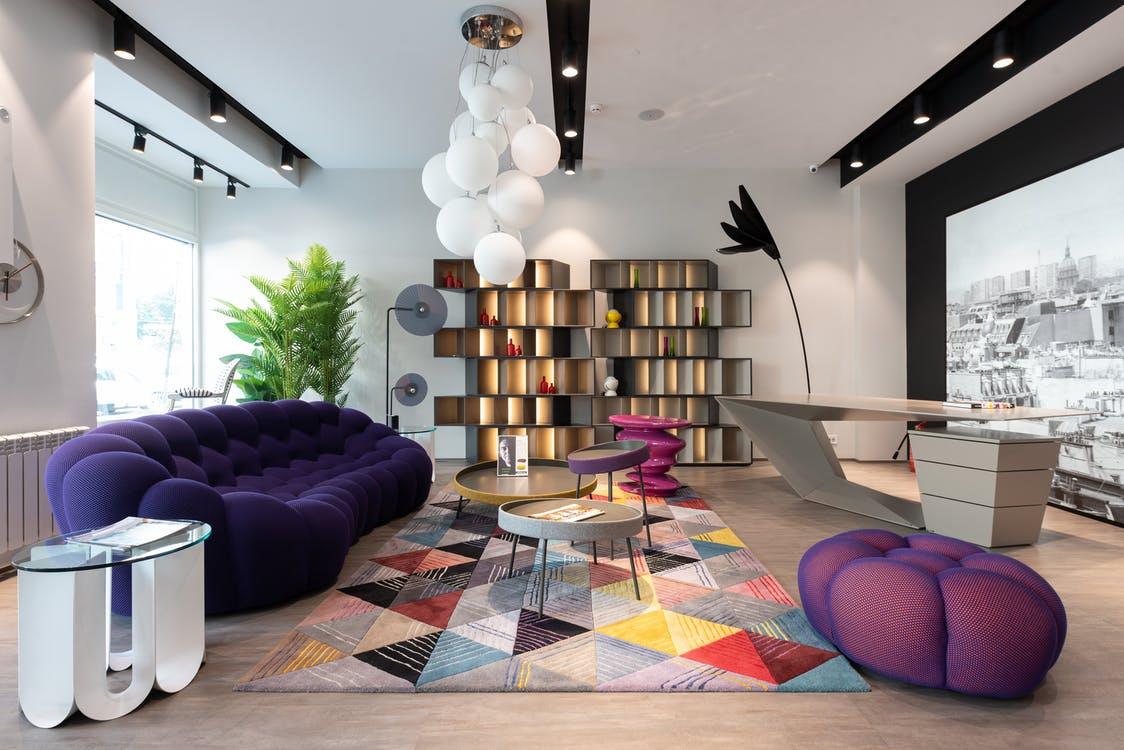
PALE AND SUBTLE VIOLET
The kind of elegance and magic shades of violet can bring to any room is unparalleled. The various tones of lilac and purple available can exert an alluring sheen to your walls and ceilings, thereby resembling a twilit day.
This trend is widely popular among those who want to stick to a moody environment in their rooms. Since the colors suit both dark and light conditions, it is a very versatile choice. It imparts a calm feeling when it gets dark and reflects the brightness when it is sunny. Unlike colors like pink and blue, violet shades fit any gender-specific requirements and are therefore quite flexible. No matter what vibe you are planning to set – cheerfulness, romance, silence, homeliness – these tones can offer good depth and beauty to them.

The Pantone Color of the Year 17-3938 Very Peri could be incorporated into the colors of your walls and ceilings.
BRING THE SUNSHINE INSIDE
With the advent of the modern work-from-home setup which is not going obsolete anytime soon, people want their interiors to resemble the outdoors as much as possible. This would explain why colors that communicate the feeling of sunlight and the associated warmth. Since these colors also emit joy and radiance without being too overbearing, they are some of the favored choices to pick from this year. For those looking to switch from an earthy and cool environment to a rather sunny feeling, look no further!

Bright yellow and light orange hues that bring a lot of positivity to interior spaces will be an awesome choice in this regard.
DIGITAL AND SURREAL SHADES
Another trend prevalent among people who explore cooler shades for their rooms is the preference for digital colors and undertones. This is probably something influenced by their proximity to screens and technology in recent years. There are a broad set of colors available that reflect this hybrid version of life today. Light pink and rose shades, bursts of citrus (like mustard yellow or bright orange), deep violet hues, raspberry, etc are some options that would play well with this aesthetic. Organic materials and textures like wood, resin, granite, and marble pair well with this theme and gives a balancing look.

We understand that working with color patterns and arriving at an optimum one for your home or office can be really challenging, and we hope we have made the task much easier for you. Now that you know what are the colours and combinations that are going to define the interior designs this year, it is time to pick your favourite and implement them effectively into your walls and ceilings.